You see them all the time in the street, on coffee tables, in-store and restaurant windows—flyers.
Although those promotional flyers often go unnoticed or end up in the trash, when they’re done well (read: designed well), flyers can catch a potential customer’s attention and even get them to take action.
Whether you’re a retailer looking to design a flyer to promote your new collection, a special promotion or a pop-up shop or event, or you’re a restaurant owner looking to promote your new menu, special event or your restaurant’s grand opening, flyers can be a great addition to your marketing efforts.
Whatever your objectives are, check out the 10 brilliant flyer designs below to get inspired for your next project.
Best retail flyer designs
For your next end-of-season sale

Image source: creativemarket
When it comes to promoting your next sale, there are two pieces of information that you need to feature in your flyer design: what you’re promoting (a sale) and its value (up to 50% off). Make that information as easy to find as possible, even for someone who’s just glancing at the flyer.
One way to achieve this is by not using too much text. Only include copy that supports the flyer’s goal. No more, no less.
The next most important thing you can feature is the type of products or lifestyle that your store sells. In the example above, it’s streetwear and athleisurewear. What this example does right is that it doesn’t try to do too much. Each photo features one product (or two if you count the socks) on a background clean and supported by the one accent color. It looks stylish, and that’s what you want people who look at the flyer to think. If your flyer is stylish, then your store is stylish. If your store is stylish, then the customer can be stylish by shopping there.
Don’t use a flyer to just sell a product. Use it to sell an ideology—a version of the customer that they can aspire to be.
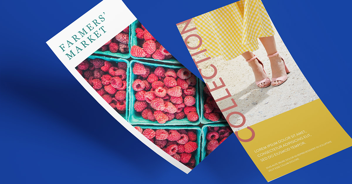
To drum up interest for your new collection
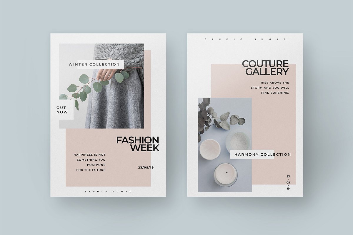
Image source: creativemarket
Similar to the first flyer design example, this one plays on neutral colors and uses a discrete splash of color and simple geometric shapes to give it some personality. While you can still find the critical information (the when and the where) this flyer design is decidedly minimalist—and that’s not a bad thing.
To promote the festival you’re selling merch at
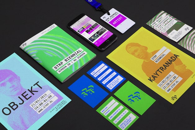
Image source: bpando
Not all flyer designs need to feature soft, neutral colors, though. If the situation calls for it, vibrant colors can also look awesome. Using bright, bold colors like the flyers above have is a great way to immediately grab a person’s attention.
The important thing to remember when deciding to use vibrant colors is whether or not they match the overall style of your store or the event. If they do, go for it. If they don’t, then the flyers might throw people off because they aren’t on brand.
Vibrant colors work in the example above because they’re promoting a music festival. The event is youthful and high-energy. It only makes sense that the flyers are as well. Vibrant colors set the right expectation and match the event’s tone and vibe.
For the awesome in-store event you’re hosting

Image source: inspirationde
Along with marketing your next in-store event on Facebook and Instagram, you’re going to want to create flyers to promote the event in your store. The above flyer is a great example of an in-store event promo flyer done right. Here’s why:
Firstly, the critical information is extremely visible. Readers immediately know the title of the event, when and where it’s happening. Secondly, the one image they include directly reflects the event’s target audience. For both of those reasons, this is an effective flyer.
In terms of colors, we hope you’re noticing a trend here. Stick to a maximum of four colors. Anything more than that can look busy and actually make the flyer harder to read.
For your next seasonal sale

Image source: paperandtype
When it comes to a seasonal sale, you want to add imagery to your flyer that reflects the season—just like what the example above does.
Not every flyer needs to have neutral backgrounds and accent-colored geometric shapes to be considered minimalist and clean. The example above features one blown-up, elegant image, and gives customers the information they need to take action (what the event is, where and when it takes place).
Bonus: this example uses also makes great use of line breaks to organize the information. This increases the flyer’s readability—especially for people just casually glancing at the flyer.
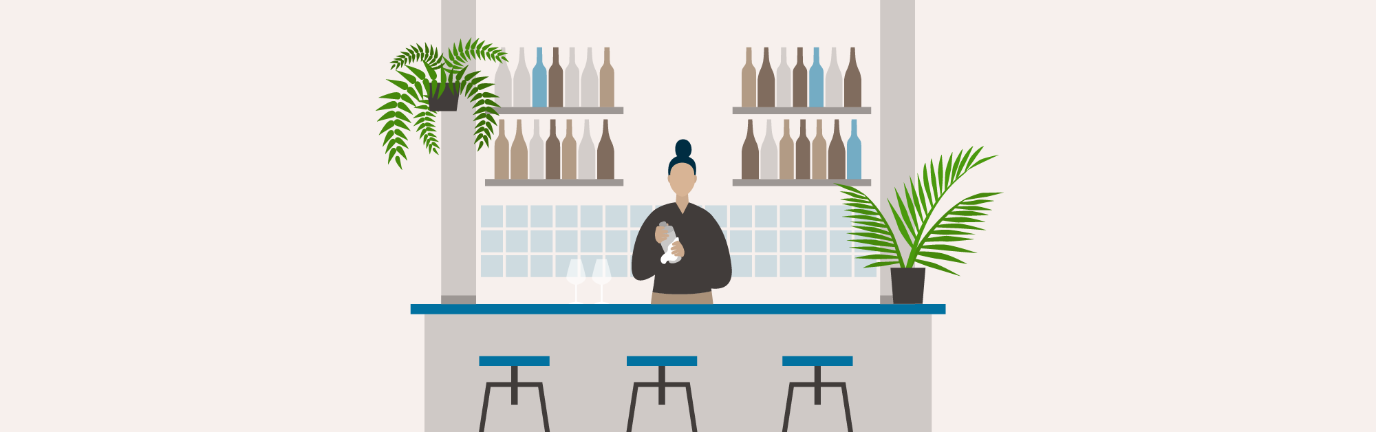
For that workshop you’re leading

Image source: thisisgatz
Another design technique you can consider exploring is using graphic illustrations rather than live photos. While they’re not optimal for selling physical products like home decor or apparel, graphic illustrations are a way to show off your creative spirit while visually describing the purpose of the flyer.
In the example above, the illustration clearly shows a workshop table. It’s simple, minimalist design is both stylish and clean while communicating the event’s purpose loud and clear. Additionally, they use a vibrant blue color to draw attention to the key pieces of information (what, where, when).
For your upcoming pop-up shop shop
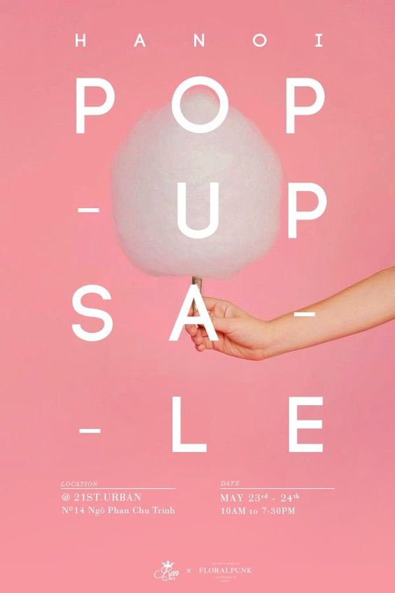
Image source: Julia Doan
Everyone likes a little attention. That’s especially true if you’re opening a time-sensitive pop-up shop! Your objective is to generate as much buzz and interest for your pop-up as possible. To do that, you should consider using a trendy, bright color like the flyer design above.
Best restaurant flyer designs
To promote your specials

Image source: Canva
When it comes to promoting food, using good-quality, high-resolution pictures is a must. Let’s say you’re promoting a special like the pizza restaurant flyer above, not only do you want to cover the what, where and when, you want to make your restaurant’s food look so good that customers feel as though they need to try it—that’s why there’s a close-up shot of the pizza to emphasize its ingredients and textures.
In addition to a prominently-featured high-resolution image, this flyer also does a great job of leading the viewer’s eye to the what, where and why by using an eye magnet.
Wait, what’s an eye magnet?
Eye magnets are any type of graphic element (photo, illustration, differently colored boxes, borders, etc) that draw someone’s attention towards a specific area of the flyer.
To drive attention to your next themed event
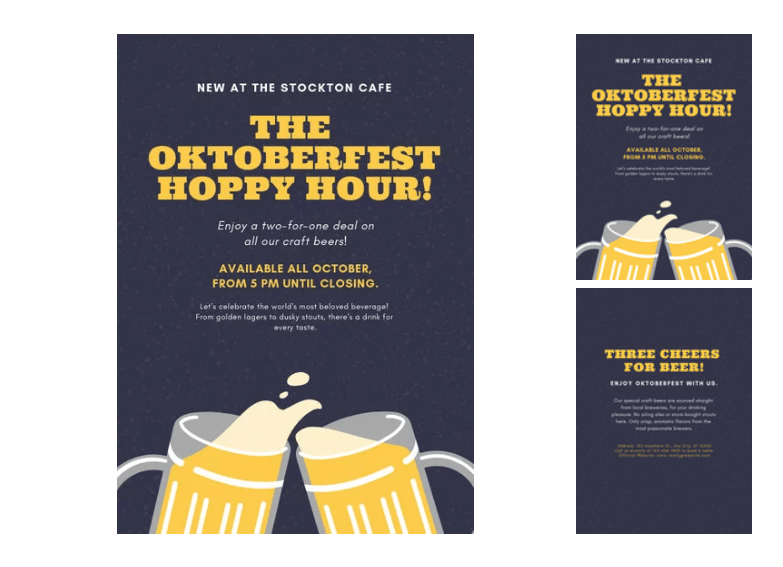
Image source: Canva
Don’t be afraid to show off some personality with some graphic illustrations like the above flyer promoting their Oktoberfest special. Although subtle, the beer graphic they used pays homage to the wildly-popular “cheers” emoji on your iPhone. Don’t believe us? Go ahead. Open up messenger and search for “cheers”, this emoji will pop up ?).
Another thing this flyer did right was using contrasting colors like dark blue and yellow to make the event information really stand out on the page. This cohesive color palette also sticks to 3 colors total (dark blue, yellow, and white), which increases its readability and elevates its aesthetic.
To promote your grand opening
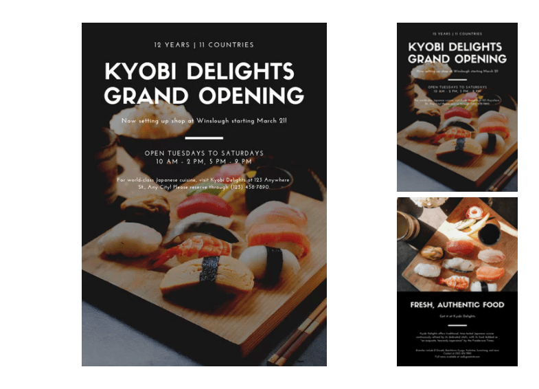
Image source: Canva
The above flyer is a great example of a grand opening flyer done right. It’s simple and fresh, just like the sushi they serve. By prominently featuring their food and adding a dark, opaque layer over top of it, they’re able to make the white text really stand out.
Sushi is typically a high pricepoint meal, which explains why Kyobi Delights went with a clean, minimal design. Typically, minimal designs look more expensive. Conversely, designs with a lot of different colors and photos look like they reflect a lower pricepoint establishment. Whatever design decision you take, make sure it fits in with your restaurant’s brand, price point, and target market.
Key takeaways to effective flyer design
Each of the above flyer designs are strong for a variety of reasons, but the key takeaway here is that a thoughtful, well-executed flyer design makes a big difference in both how your business is perceived and how effective the flyer is at converting your audience’s attention into action. The three most crucial basic elements of any flyer design are the following:
So what can we take away from all these examples? Let’s take a quick look at a few basics:
- Typography: while there are a ton of fonts out there to choose from, always choose a font that’s easy to read for your flyer design. We recommend sticking to sans-serif fonts (just like the font we’re using to write this blog).
- Color: when in doubt, always defer to using either complementary colors (opposites), choosing colors based on temperature (warm or cool), or matching a neutral like white or black with an accent color to add a splash of personality. Colors can dramatically change the way your flyer looks, so choose wisely before sending them to print.
- Layout: one thing each of the above flyers have in common is that everything from their photos to their text was thoughtfully laid-out. Pay attention to things like alignment, spacing, and the balance of objects on the page. Together, they can be the difference between a polished, carefully-crafted flyer design and one that looks rushed and amateur.
News you care about. Tips you can use.
Everything your business needs to grow, delivered straight to your inbox.