A huge amount of retail sales appear online these days. Whether you’re building an eCommerce business or a webshop to supplement your existing one, it’s worth investing both time and money into eCommerce website design.
Let us guide you through how to design an eCommerce website that converts!
1. Follow the KISS rule
2. Express your brand identity
3. Think like the user
4. Use colour wisely
5. Make it scannable
6. Be professional
7. Provide social proof
8. Make it easy to navigate
9. Simplify checkout
10. Make it responsive
Start your online store today
Bring your products online and start selling fast with our foolproof quickstart guide.
1. Follow the KISS rule (Keep it simple, silly)
When designing your eCommerce website, it’s important not to lose sight of the ultimate goal: to close sales.
Users should land on your website, find what they’re looking for, and make a purchase. Simple as that.
Crowding your website with bells and whistles distracts away from that ultimate goal. It could even send users looking elsewhere to make a purchase.
That’s why simplicity is such an important tenet of eCommerce web design.
Think of your eCommerce website as you would a bricks-and-mortar shop.
Its design should entice customers to stick around long enough to make a purchase. Moreover, customers should be able to find what they’re looking for with ease.
A cluttered and disorganised space can quickly overwhelm customers and send them running.
The same is true for digital spaces. Ensure a positive experience for visitors and keep it simple, silly.
2. Express your brand identity
Why is branding important for eCommerce web design?
A consistent and recognisable brand identity shows that you’re established, and builds trust—an important driver of online sales (since it involves giving over credit card information).
Aside from trust, branding also inspires loyalty and can lead to long term consumer-brand relationships.
Establish your brand through the colours, fonts and images you use in your web design.
Good design makes for good brand experiences, which leads to loyalty, satisfaction, trust and repeat business.
3. Think like the user
Ask yourself, what do you want from a webshop?
You probably want the experience to be easy, fast and painless.
The same can be said for your users. Their personal experience with your eCommerce website will weigh heavily on their buying decision.
Design your webshop with their needs and behaviour in mind.
Give them the information they need, with the least amount of effort required on their part.
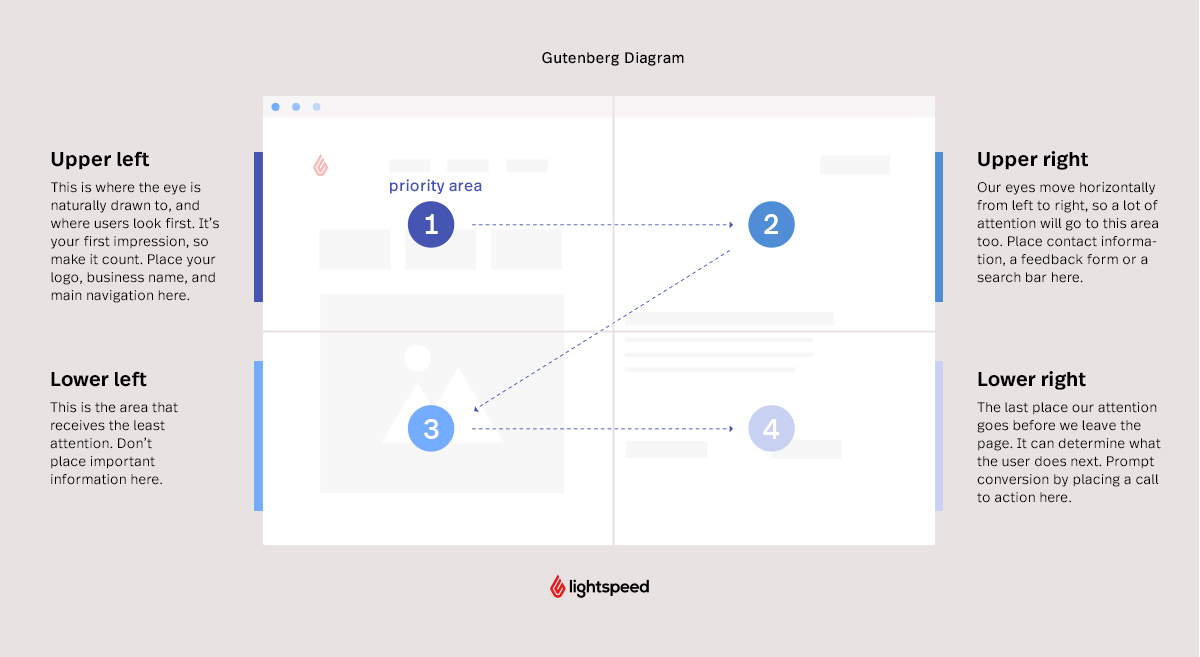
One classic guide to human-centric web design is the Gutenberg Diagram.
It informs us where certain elements should be placed in your eCommerce website’s design based on how our eyes scan a page.
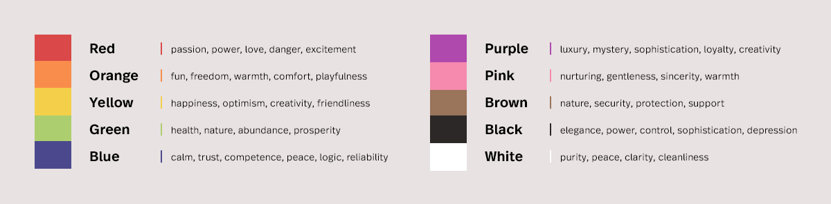
4. Use colour wisely
A crucial aspect of branding and web design is the colours you use.
Colours are a powerful communication tool, impacting users on a subconscious and emotional level.
Use them to influence how users perceive your brand.
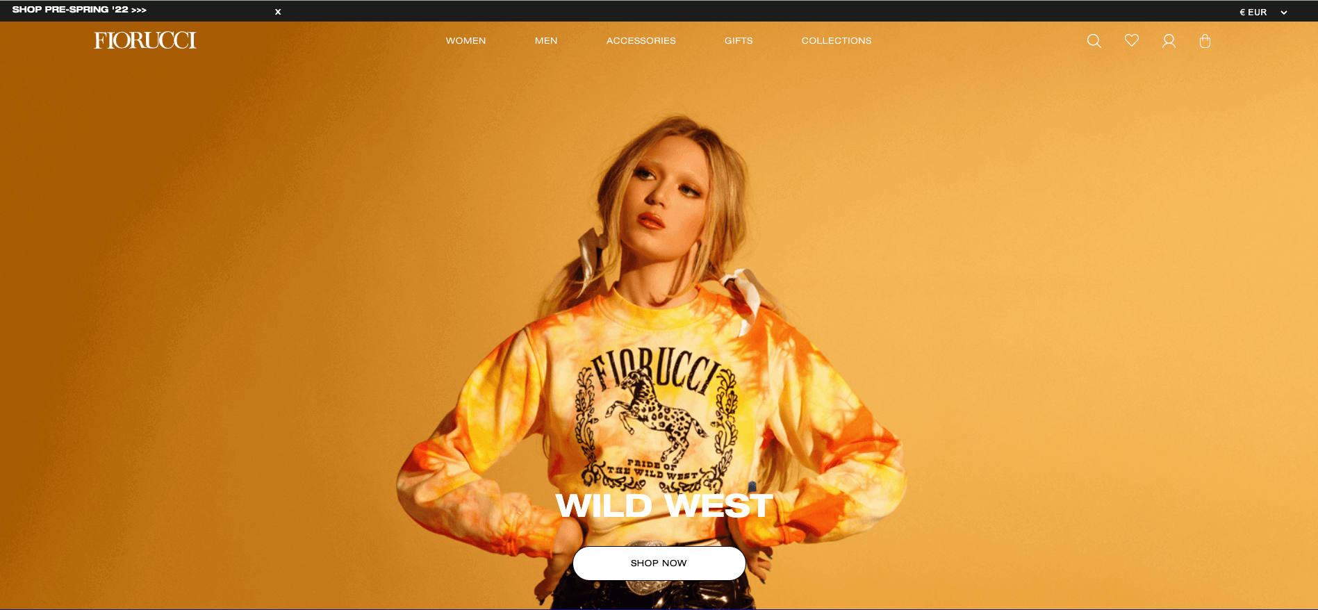
Are you a luxury brand? Use black or purple to communicate that.
Selling children’s toys or holiday packages? Use orange or yellow to trigger a sense of optimism and excitement.
You can also use colour to lead users’ attention to where you want it to go.
A call to action button that contrasts heavily with the background colour of your eCommerce website will stand out and increase the likelihood of conversion.
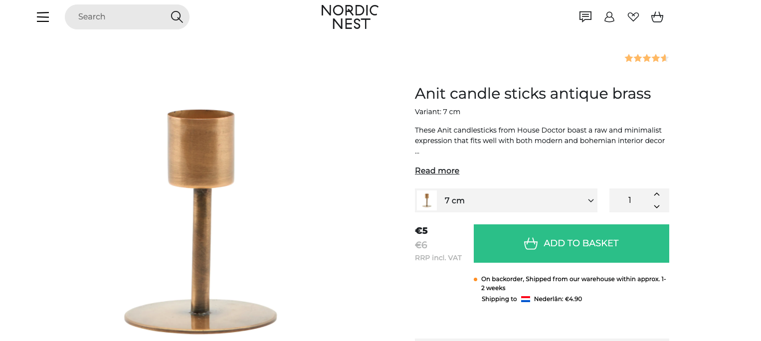
Notice how Nordic Nest break away from their normal colour palette with a bright green call to action that stands out to users.
How colours influence us
- Red conveys a sense of urgency, so is usually the first choice for CTA buttons
- Blue communicates trust and equanimity, great for making customers feels safe and secure when shopping on your website.
- Green is at the centre of the colour spectrum. It indicates balance and can give an organic, natural feel to your website.
- Yellow is a happy colour, it evokes optimism. Use yellow to inspire a cheerful feeling.
- Orange combines the optimism of yellow and the urgency of red
- Purple communicates luxury, sophistication, even royalty. It has a slightly different impact when used in light or dark shades.
- Black also speaks to luxury, but with more boldness.
5. Make it scannable
On average, users only read about 20% of the text on a webpage. If your eCommerce website is too text-heavy, it could turn prospective customers off pretty quickly.
Don’t overload your customers with textual information—rely on imagery instead. Communicate what you need to in a digestible, scannable format.
- Use bullet lists (like this one) where you can, especially when outlining a product’s features of benefits.
- Highlight keywords so that users don’t need to do much work to get to specifics
- Use short sentences and keywords to get the message across.
6. Be professional
Your eCommerce website should emit an air of professionalism.
After all, users are expected to give over sensitive information like credit card numbers. You need to earn their trust.
There are subtle ways to show them that your website is the real deal, not a scam.
- Avoid typos or misspellings that make your website look rushed and trigger users’ suspicions.
- Be consistent with your branding. Use the same fonts and colours through your eCommerce website.
- Include logos of the trusted brands you sell.
- Clearly provide business and contact information.
7. Provide social proof
As you may have figured out by now, driving conversion on your eCommerce website is about establishing trust—trust, trust, trust.
Incorporating social proof into your web design shows users you’re legit.
- Include testimonials from real customers about the quality of your products and service.
- Add a rating section so customers can review products they’ve bought from you.
8. Make it easy to navigate
Remember our earlier analogy of an eCommerce website as a bricks-and-mortar shop?
When you enter a shop, you expect to find what you’re searching for, or where to get assistance, with relative ease.
The same can be said for your webshop.
A well-designed website will lead visitors where they want to go, with as few steps in between as possible.
This is what’s known as your website’s navigation, and it can have a big impact on conversion.
We’ve all been on websites with poor navigation, and we all know how frustrating they can be.
Design your eCommerce website so that users can find what they need and make a purchase without getting frustrated and taking their money elsewhere.
Consider the Gutenburg Diagram from earlier. Place information like product categories, reviews or product deals in the top left of your eCommerce website.
Other elements to prioritise in the navigation are:
- Search bar
- Menus
- Cart icon
- Products lists
- Product pages
9. Simplify checkout
The checkout is the last step in closing a sale on your eCommerce website, and the most important.
A slow and clunky checkout experience could deter customers at this critical stage.
First, the checkout needs to be clearly marked on the webpage. It should be visible at all times, ready for users to click on and complete their purchase.
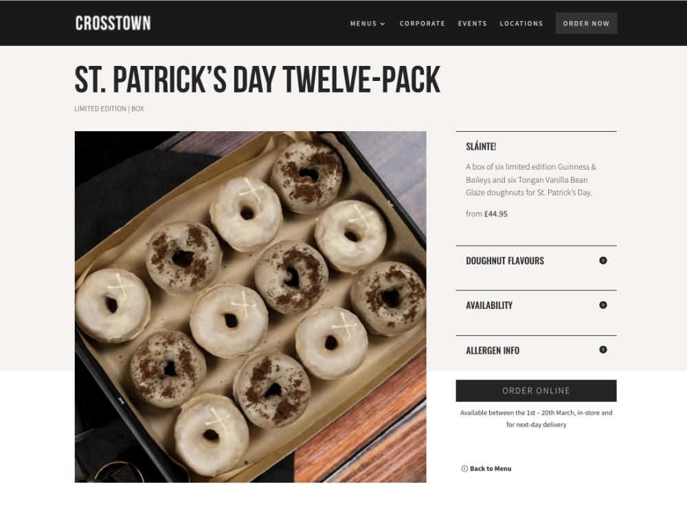
Remember that the last place a customer looks before they leave a page is the bottom right, so placing a checkout button here could reduce drop off and boost conversion.
Notice how Crosstown Doughnuts have a checkout call to action at the bottom and top right of their product pages.
That said, the checkout button shouldn’t interrupt the shopping experience.
Users should be able to move seamlessly between the checkout and product pages.
Moreover, when customers click on the checkout button, certain information should be visible.
- A breakdown of items in the basket with both their respective prices and the cumulative price
- Which shipping options are available and associated costs
- User data needed to complete the purchase like name, address and card information
- Estimated time of delivery
Once the user has completed the purchase, they should be directed to a confirmation page so they know it’s final.
10. Make it responsive
Ever tried to make a purchase on your mobile on a site that’s designed for desktop only? Pretty horrific experience, right? The kind that won’t have you itching to return to that website anytime soon.
Most online interactions and transactions happen on mobile these days. That’s why it’s really important to make sure your website is mobile responsive.

News you care about. Tips you can use.
Everything your business needs to grow, delivered straight to your inbox.